Sunday, 29 September 2013

Friday, 27 September 2013
Website layout
Today, we are learning how to create a website layout with guide.
 |
| Rename the layers nicely. |
 |
| Insert new guide. |
 |
| Almost done. |
Monday, 23 September 2013
Movie Teaser Poster - Design proposal
Movie Genre
Drama, Romance
Plot
One day, Elsa went out to get some inspiration for her photograph and she got hit by a car. This accident caused her coma. Five years later, she regain consciousness, she lost her memory which caused her amnesia from childhood.
Design Hook
Girl, loves latte, drinks latte, starts get back her memory little by little.
Visual Concept
I used the cartoon style couple for the foam art latte design is because I do not want audience know who is my main character while still in movie teaser poster. Movie teaser poster do not use too many props, it will show as little as possible to give audience suspense about it. At first, I was think of a few simple concepts, one of it was the smoke of latte went to a love shape. This is what I think of.
After few sketches, I get another idea which is the one I am using. The latte is the main things that help Elsa get back her memory and happy ending with John. Latte art is also very famous nowadays. So I decide to create a latte art of this couple, to make people curious about what Elsa’s best friend do to her.
It is too simple if there is only a cup of latte art. Therefore, my lecture gave me suggestion that add the coffee shop in. It is works but it was quite difficult to find a suitable coffee shop to place it in this movie teaser poster.
Design Technique & Method
After selected the sketch, I start doing it in Adobe Photoshop. I love latte art, but I do not have the skill to make it, so I started with finding images through Internet. It was so hard to find an image that my mind was thinking. I want to search for a white cup taken from top. I did found it but the foam inside is not the foam I want so I looking for another cup of coffee and one more cup of foam to combine it.
Next, I placed a couple’s picture that I want to become my latte art in Photoshop. I used pen tool to crop it and changed it to blank and white. Then, I tried to make it softer and make the edges rounder. So that it will not look like very fake.
Done the latte art, I continued to placing the coffee shop that I searched online in different angle, different way and different lighting. It look weird, it does not match to my latte art. But I did not give up I keep trying, and finally I had applied the brush that it almost looks like coffee stains. But, the color still cannot match. My friends suggest me to use real coffee to paint it, so I can adjust the color I want. But I felt like not enough time to do that, then I continue try the different Hue and Saturation. I did it finally!
For the background, I cropped it few times, but it still does not look like blend with the coffee shop. Although I used feather, but the path I crop is not accurate, so have to crop it very detail.
The last part is about the typography, I wanted to use a chalkboards typefaces but I cannot download it, have to buy it. So I keep searching on the similar typefaces that is free download, I almost want to create it myself. I know it is quite wasting time, but at the same time, I saw a typeface called dearJoe 5 CASUAL, it looks like the typefaces that I want without the chalk but handwriting in Dafont.
When I finished my movie teaser poster, I was so happy. I learnt a lot with the tools of Adobe Photoshop.
Saturday, 21 September 2013
Friday, 20 September 2013
Movie Teaser Poster - Photoshop (Done)
Still in progress...
 |
| original coffee shop |
 |
| Adjust the Hue and saturation (Ctrl+U) with tick the colorize |
 |
| try different filter |
 |
| trying the filter |
 |
| adjusting the color |
 |
| Use the Brush in Filter Gallery |
---------------------------------------------------------------------------

Monday, 16 September 2013
Movie Teaser Poster - Photoshop (Pending)
The images below are the images i selected to used as my movie teaser poster.
 |
| Couple |
 |
| Coffee Shop |
 |
| background |
 |
| The cup |
 |
| The latte |
---------------------------------------------------------------------------
The images after i crop
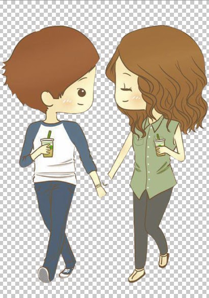 |
| crop it |
 |
| change it to black and white and then delete the black part |
 |
| put the edited couple into the latte |
 |
| crop half page and turn it 180 degree to delete the clock use crone stamp tool to edit a little bit |
--------------------------------------------------------------------------------------
The progress ...
The progress ...
 |
| latte art - couple |
 |
| placing the coffee shop |
 |
| i feel like this is better place to put the coffee shop |
 |
| added the caption |
These are the progress that i have done until now. :)
Sources:
http://favim.com/image/525731/
http://favim.com/image/525731/
http://homesteaderkitchen.com/ninja-blender/hot-lattes-ninja-kitchen-system-blenders/
http://www.mrwallpaper.com/view/coffee-xmas-foam-1600x1200/
http://www.marcussamuelsson.com/news/america-home-of-the-world%E2%80%99s-best-barista-drink-day-with-elizabetta-tekeste
http://www.flickr.com/photos/planetperki/4368496479/sizes/o/in/photostream/
http://www.flickr.com/photos/einafets/2568871022/sizes/o/in/photostream/
Wednesday, 11 September 2013
Week 3 - Adobe After Effects Exercise (Day to Night)
Today, we have learnt something new.
See the bottom bar, "Toggle Switches/Modes"
Click on it, it will show a bar called "Mode"
See the bottom bar, "Toggle Switches/Modes"
Click on it, it will show a bar called "Mode"

Click the "Noormal", then you can select what mode you want.
For example, you select "Lighten"
For example, you select "Lighten"

It changed to "Lighten".

Exercise of today :)
Subscribe to:
Posts (Atom)